When I first started working with Angular and Material Theming for my side projects, creating custom themes felt daunting. Perhaps it was because I didn’t fully grasp the theming concepts back then—or maybe I was just too lazy to dig deep into it. As a result, I stuck with the pre-built themes.
I did manage to implement a light-dark mode switch for my hackernews clone but the solution was far from ideal. At the time, I achieved this by swapping entire CSS stylesheets, with each stylesheet representing a theme. While it worked, I wasn’t happy with the result.
In recent years, I’ve primarily been working with ReactJS, and my interest in Angular had faded. However, today, I decided to brush up on my Angular skills and revisit the light-dark mode switch. To my surprise, the tooling has improved significantly, and implementing the feature was much easier this time. So, let’s dive in!
Create a New Angular Project and Add Material
Start by following the Angular and Material documentation to create a new project and integrate the Material library into your app.
Create a Custom Theme
To design your custom theme, you can use the Material Theme Builder. This tool allows you to experiment with different color palettes and preview how Material components will look with your chosen colors.
Although the tool lets you download generated CSS stylesheets, I found that the CSS variables were not in the correct format. For this reason, I chose not to use the generated CSS directly. However, the Theme Builder was invaluable in helping me select a color palette and understand the overall look and feel.
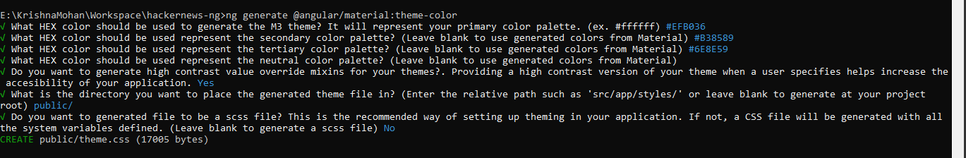
Once you’re happy with your colors, you can use the Material 3 Custom Theme Schematic to generate the theme CSS file. Here’s what you’ll need to do:
- Run the schematic command:
ng generate @angular/material:theme-color
- Answer a few prompts to define your theme:
- Primary color (required)
- Secondary color (optional)
- Tertiary color (optional)
- Neutral color (optional)
- High-contrast values (optional)
- Output directory for the theme file (optional; defaults to the current directory)
- CSS or SCSS format (optional; defaults to SCSS)
Although Angular recommends using SCSS, I opted for CSS in this case.
Updating the code
Once your theme file is generated, update your angular.json file to include the theme CSS. For this example, I saved the CSS file in the public folder.
"styles": [
  "public/theme.css",
  "src/styles.css"
]
Next, create a new component that includes a toggle button to switch between light and dark modes.
import { Component, effect, OnInit, Renderer2, signal } from '@angular/core';
import { MatButtonModule } from '@angular/material/button';
import { MatIconModule } from '@angular/material/icon';
import { MatTooltipModule } from '@angular/material/tooltip';

@Component({
  selector: 'app-theme-picker',
  imports: [MatButtonModule, MatTooltipModule, MatIconModule],
  template: `
    <button mat-icon-button (click)="changeMode()">
      @if (mode() == 'dark') {
      <mat-icon>
          light_mode
      </mat-icon>
      } @else {
      <mat-icon>
          dark_mode
      </mat-icon>
      }
    </button>
  `,
  styleUrl: './theme-picker.component.css'
})
export class ThemePickerComponent implements OnInit {

  mode = signal('light');
  static storageKey = 'docs-theme-storage-current-name';

  /**
   *
   */
  constructor(private renderer: Renderer2) {
    effect(() => {
      if (this.mode() == 'dark') {
        this.renderer.setStyle(document.documentElement, 'color-scheme', 'dark');
      } else {
        this.renderer.setStyle(document.documentElement, 'color-scheme', 'light');
      }
    });

  }

  ngOnInit(): void {
    const currentTheme = this.getStoredThemeName() ?? (window.matchMedia('(prefers-color-scheme: dark)').matches ? 'dark' : 'light');
    if (currentTheme) {
      this.mode.set(currentTheme);
    }
    window.matchMedia('(prefers-color-scheme: dark)').addEventListener('change', event => {
      const newColorScheme = event.matches ? "dark" : "light";
      if (event.matches) {
        this.mode.set('dark');
      } else {
        this.mode.set('light');
      }
    });

  }

  changeMode() {
    if (this.mode() == 'dark')
      this.mode.set('light');
    else
      this.mode.set('dark');
    this.storeTheme(this.mode());
  }

  storeTheme(theme: string) {
    try {
      window.localStorage[ThemePickerComponent.storageKey] = theme;
    } catch { }
  }

  getStoredThemeName(): string | null {
    try {
      return window.localStorage[ThemePickerComponent.storageKey] || null;
    } catch {
      return null;
    }
  }

  clearStorage() {
    try {
      window.localStorage.removeItem(ThemePickerComponent.storageKey);
    } catch { }
  }

}
Add this component to your webpage, and you’re done!
That’s it! With the improved tooling and resources available, implementing custom themes and a light-dark mode switch in Angular has become much simpler. Give it a try, and let me know your thoughts!